
I’ve always known that data visualization is essential for communicating insights, but Storytelling with Data made me realize just how much thought and intention go into making data truly resonate with an audience. A good chart isn’t just about plotting numbers—it’s about guiding the viewer’s attention, removing distractions, and making insights clear.
This book is packed with strategies to make data storytelling effective, and I found some takeaways particularly eye-opening.
Context First, Visualization Second
One of the biggest mistakes people make—including myself at times—is jumping straight into designing a graph without thinking about who it’s for and what it needs to convey. But the book makes it clear: context is everything. Before choosing a chart type or tweaking a design, I now ask myself a few key questions:
- Who is my audience? A technical team needs a different level of detail than a general audience.
- What’s the key takeaway? If I had only three minutes to explain my findings, what would I say?
- How does the data support my message? Am I simply presenting numbers, or am I using them to tell a story?
The idea of creating a storyboard before jumping into visuals also resonated with me. Sketching out a rough narrative—starting with the issue and leading to the takeaway—helps me avoid getting lost in unnecessary details.
Choosing the Right Visual
I’ve always felt that not all charts are created equal, and this book validated that feeling. It breaks down exactly when to use different types of visuals—and when to avoid them.
For example, if I only have two numbers to compare, why bother with a chart at all? Just stating the values directly is often clearer. On the other hand, when I need to show trends over time, a line graph makes much more sense than a table full of numbers.
Some insights that stuck with me:
- Tables work best when people need to look up specific values, but they can be overwhelming in presentations.
- Heatmaps are a great way to highlight patterns in a table without making people scan through numbers manually.
- Bar charts are my new default for comparing categories—they’re clean, easy to read, and make comparisons obvious.
- Pie charts? Avoid them. Our brains aren’t great at comparing angles, and a simple bar chart is almost always better.
One lesson I’ll definitely apply is always using a zero baseline for bar charts. Cutting off the baseline makes differences seem more dramatic than they are, and while it might look “cool,” it instantly destroys credibility.
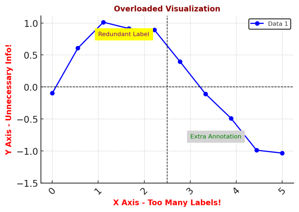
Decluttering for Clarity
This book made me painfully aware of how much clutter I’ve tolerated in my own visualizations. Gridlines, unnecessary labels, excessive colors—these things don’t add value; they just increase cognitive load.
One of the best takeaways for me was learning how to use whitespace intentionally. Instead of filling every inch of a slide with information, I now think about how to create breathing room so that my audience can actually focus. It turns out that less really is more when it comes to effective data visualization.
This shift in mindset aligns with concepts from visualization experts like Edward Tufte, who emphasizes maximizing the Data-Ink Ratio—focusing only on elements that truly communicate information. Similarly, Robin Williams’ CRAP principles (Contrast, Repetition, Alignment, and Proximity) provide a practical guide to making visuals clean and impactful. Keeping these principles in mind helps ensure that every part of a visualization serves a purpose rather than adding unnecessary noise.
Directing Attention Where It Matters
The next valuable concept in the book is preattentive attributes—the idea that certain visual cues (like size, color, and position) naturally grab our attention before we even start consciously thinking.
This is something I’ve seen done well in great visualizations but hadn’t fully grasped how to apply myself. The key is not to overuse these attributes—a bright color stands out only if the rest of the visualization is more muted. If everything is emphasized, then nothing is.
Here are examples what I’m focusing on now:
- Size: Important numbers should be larger, but everything shouldn’t be oversized.
- Color: Less is more—if I’m using multiple colors, they need a consistent purpose.
- Position: People naturally read from left to right and top to bottom—placing key information in expected areas helps comprehension.
Just these small shifts have already made my visuals more focused and effective.
Storytelling is the Glue That Holds It All Together
I used to think that if my data was strong enough, the numbers would speak for themselves. But the truth is, data alone isn’t enough—it needs a narrative.
The book introduces a simple three-act structure that I’ve started applying to my own data presentations:
- The Setup – What’s the problem? Why should the audience care?
- The Conflict – What does the data reveal? What’s interesting or unexpected?
- The Resolution – What should the audience take away or do next?
Without a clear structure, even the best data visualizations fall flat. But when there’s a compelling narrative, people actually remember the insights and, more importantly, act on them.
One trick I love from the book is repetition—reinforcing key messages by repeating them in the headline, in the graph, and in the conclusion. It makes the takeaway crystal clear and prevents confusion.
Final Thoughts
I went into Storytelling with Data expecting technical advice on charts, and while I got that, what surprised me most was how much it emphasized communication, design, and psychology.
It completely changed the way I think about data visualization. Now, instead of just trying to make graphs “look nice,” I focus on how they function—whether they guide the audience’s attention, tell a clear story, and make the data truly meaningful.
If I had to summarize my biggest takeaways, they’d be:
- Start with the audience and the message—don’t jump straight into making a chart.
- Choose the simplest and clearest visualization for the data—avoid unnecessary complexity.
- Declutter ruthlessly—everything on the slide should serve a purpose.
- Use color, size, and positioning intentionally to direct attention.
- Structure data like a story so people remember and act on the insights.
The best data visualization isn’t the one with the most details or the coolest design—it’s the one that makes the insight impossible to ignore.
Now, every time I create a chart, I ask myself: Am I just displaying data, or am I actually communicating something valuable?
These are my thoughts on the book “Storytelling with Data” by Cole Nussbaumer Knaflic.
Leave a Reply